Motion Graphics Animation

I decided that a short animation would be used as a marketing tool to promote the app.

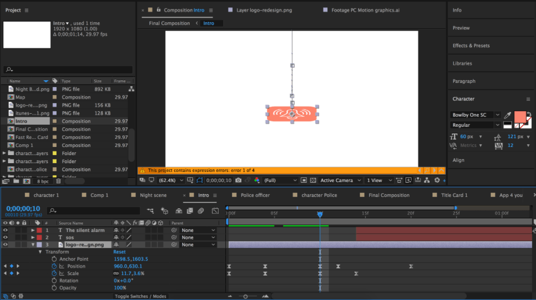
I have applied many prior techniques I learned in semster A, and also aqquired new skills with creating this new project. One new skill I have aqquired is character rigging, and I managed to acheive this with an Adobe After Effects rigging plugin known as ‘Duik’. What I first did was select the limbs and move their anchor points to the joints which I would be able to move once I applied the character rig. Here is an example:

Screen Shot 2017-04-04 at 22.45.38 
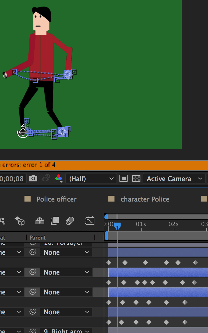
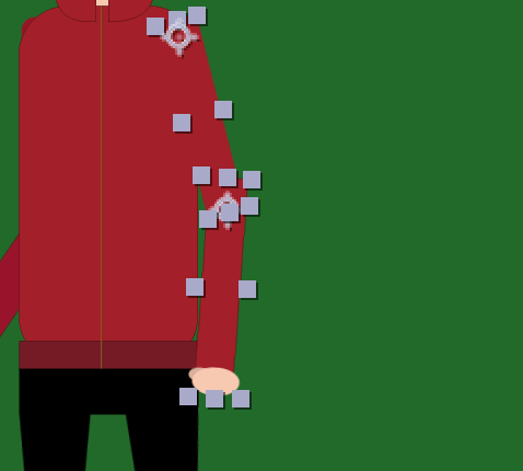
As you can see they are placed to the joints. I then parented the forearm to the upper arm, and then the upper arm to the body. I then clicked ‘controller’ on the Duik menu:

Screen Shot 2017-04-04 at 22.45.12Screen Shot 2017-04-04 at 22.45.19

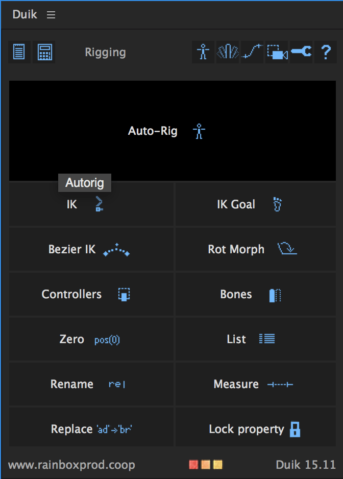
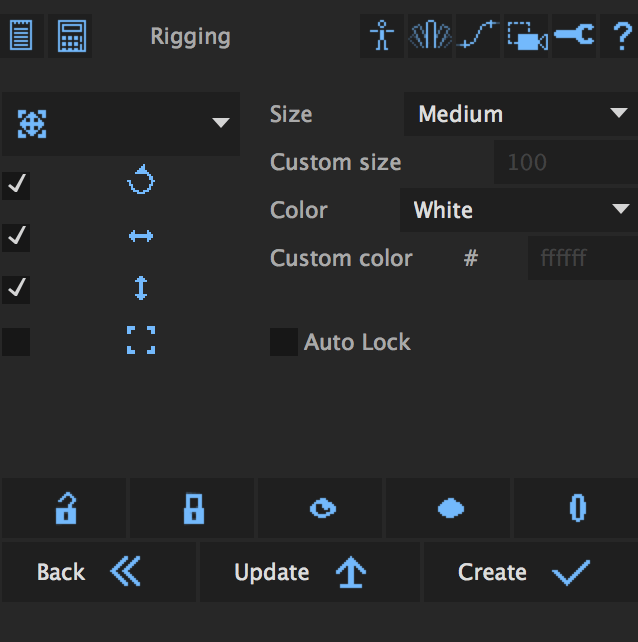
and when I selected the controller menu, I then clicked ‘Create’. But I still could not adjust the arm. So the next step was to select the new layer controller layer, and the layers they were connected too including the characters torso, and then I clicked ‘IK’ in the main Duik menu. Here is the link to the website I attained the plugin from: https://rainboxprod.coop/en/tools/duik/

Screen Shot 2017-04-04 at 22.57.39

I repeated the process for the other limbs and then I was ready to animate the character.

Here is the entire walk cycle:

Screen Shot 2017-04-04 at 23.23.15

I did not look at any tutorials on how to complete a walk cycle animation, I used my intuition which involved moving the legs and arms in separate timings to each other which is how a human walks. I also added a little bob to the body that went up and down so it looks like the character is taking steps. This can be seen more clearly in the last animated scene with the police officer.

Another skill which I learned myself was how to use the camera, and I even managed to track one of my characters. I first animated the character, I took it into another composition with my other assets, I animated the character to the position that I wanted the character to land on, and then I animated the camera to follow the character. But first I had to change all layers into 3D layers to allow me track the movement.

I also made great use of the easy ease tool by implementing it with animating my logo. I used the squash and stretch animation technique which is commonplace for all animation.

Screen Shot 2017-04-05 at 01.23.45

Adobe XD Link

https://xd.adobe.com/view/eca215ef-1b57-4a2d-99ba-f2e204c16d6f/

After I finished designing my screens in Adobe Illustrator, I imported the screens into the iPhone template. I then played with XD’s features which included designing some icons, and I also made use of the ‘Repeat Grid’ tool that allows a user to copy boxes, here is an example:

Screen Shot 2017-04-04 at 21.14.34

As you can see, with this tool, you do not need to copy and past boxes. You simply drag the item down or right as many times as you want and you will get the same size boxes. You can also adjust the distance they are apart.

I also found that in Adobe XD you can  design your own icon’s, so I drew two circles and then used the tool ‘Exclude Overlap and that cut a hole into the circle.

Screen Shot 2017-04-04 at 21.29.52

After that, I pulled down a part of the circle to make the pin point:

Screen Shot 2017-04-04 at 21.28.45

I repeated this process at least 4 more times so I could change the colour, and then the drop shadows in each one.

Screen Shot 2017-04-04 at 21.24.02

I then adjusted the colour fill in each pin icon and added text to achieve the result I wanted.

Screen Shot 2017-04-04 at 21.47.21

I also made use of the background blur. First I copied the artboards content on the left, and then I overlayed with the content on stop of it whilst bluring the content beneath it. I then seamlessley blended the background blur when the user selects ‘here’ by using a dissolve transition.

Here are all of the screens that are in my app:

Screen Shot 2017-04-04 at 21.11.07

Wizard – set up

In my original wireframe/mock-up of my app, I felt that it was appropriate to add a terms and conditions

Screen Shot 2017-04-04 at 02.45.06

This was my rough outline of what content would feature on the page, but due to feedback, I was told there was too much text on the page and that it would be too much for the audience to take in. So I was advised to look at a method called ‘Wizard set-up’

This is a design method that is implemented for the user to be able to digest monotonous content better in subsequent steps.

networksetupwizard2_6852

As you can see, there are only a few short points made and the user is not hit with a barrage of text making it easier to read. This also may be more functional for people with dyslexia.

Wizard Set-Up 1

This is how I applied the wizard set-up into my app. I realised that one simple line would take up little space, so I decided to add extra content to the wizard set-up in a form of practical advice for the user; implementing this has maximised space with no reason not to implement this feature.


SOS App Logo & Sign- in screen.

First alarm icon.

This is the first draft of my logo. I wanted to use a red alarm because I thought this is the easiest way to communicated what it meant. But there were two things wrong with this.

Number one: It is too complex. There are multiple layers with different levels of opacity, which would make this logo difficult to draw.

Number two: In the UK, alarms are more known for ringing bells and not red light flashing alarms. The flashing alarms that we have in the UK tend to be blue or yellow, depending on which emergency service is called into action.

It is also important to note that ‘PANIC!’ was a placeholder name. I recognised that having a brand name with all cap font would probably send the user panicking even more in the event of using the app, so I came up with another name along with a more suitable logo.


logo-redesign

This is my new logo. Instead of using flashing lights, I decided to use an alarm bell. Not only because British people would recognise it, but because the logo design could be designed using simply pen tool graphics which was not possible with a flashing alarm logo. I also decided to brand the product as SOS which is an abbreviation for ‘Save Our Souls’

Menu

This is the first screen of my app. The font I used for the ‘SOS’ is not a default font that comes with the PC that I designed this on. I found it on Adobe TypeFace and it is called ‘Bowlby One SC’. The lower font is Myriad Pro and I used this for the bold font on the lower heirarchy of fonts with a stroke.


InDesign excersise

In this module we have to produce a document under 24 pages. So we looked at the codes and conventions of a page design and more imporantly what not to do. This was discussed using a template that James Field designed conveying on how to place text, use margins and certain typography that is appropriate for the finished product.

We were then set a challenge on improving a pre-existing article that was poorly designed, so I set myself a goal on improving the design myself.

Here is the page before I edited it:

Vertex Page 8 - Original

Here is the edited page:

Page design