![]()
This is the first draft of my logo. I wanted to use a red alarm because I thought this is the easiest way to communicated what it meant. But there were two things wrong with this.
Number one: It is too complex. There are multiple layers with different levels of opacity, which would make this logo difficult to draw.
Number two: In the UK, alarms are more known for ringing bells and not red light flashing alarms. The flashing alarms that we have in the UK tend to be blue or yellow, depending on which emergency service is called into action.
It is also important to note that ‘PANIC!’ was a placeholder name. I recognised that having a brand name with all cap font would probably send the user panicking even more in the event of using the app, so I came up with another name along with a more suitable logo.
![]()
This is my new logo. Instead of using flashing lights, I decided to use an alarm bell. Not only because British people would recognise it, but because the logo design could be designed using simply pen tool graphics which was not possible with a flashing alarm logo. I also decided to brand the product as SOS which is an abbreviation for ‘Save Our Souls’
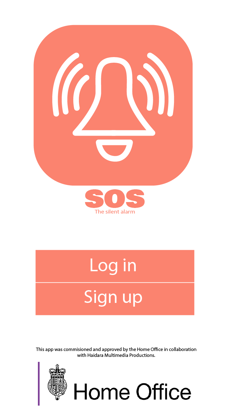
This is the first screen of my app. The font I used for the ‘SOS’ is not a default font that comes with the PC that I designed this on. I found it on Adobe TypeFace and it is called ‘Bowlby One SC’. The lower font is Myriad Pro and I used this for the bold font on the lower heirarchy of fonts with a stroke.